
My Cup of Tea Rebranding
Rebrand and update the current branding of My Cup of Tea.
October - December 2022 08 Weeks



Project Summary
My Cup of Tea had outdated branding that does connect well with their current customers. Thus, a new brand and logo were needed. It was also necessary to create a system that could be put on other products.
Project Objective
Produce a logo that represents how My Cup of Tea sees themselves.
Make a branding system that can be used for other advertising or merchandise.
Create a visual identity that connects with the target audiences.
The Challenge
My Cup of Tea former branding was extremely outdated, with no strong brand. The name of the business does not match the products, and the logo is not used. My Cup of Tea marketing is not consistent. I needed to make sure that the logo could be versatile and be used on a multitude of different items. There needed to be consistent imagery and iconography throughout the new branding for My Cup of Tea. I wanted to redesign the logo and area so that it is familiar to keep old customers but looks inviting enough to gain new customers as well.
Target Audience
Teenagers and young adults (15 - 25+ years old) living or commuting around Ocean Ave, San Francisco
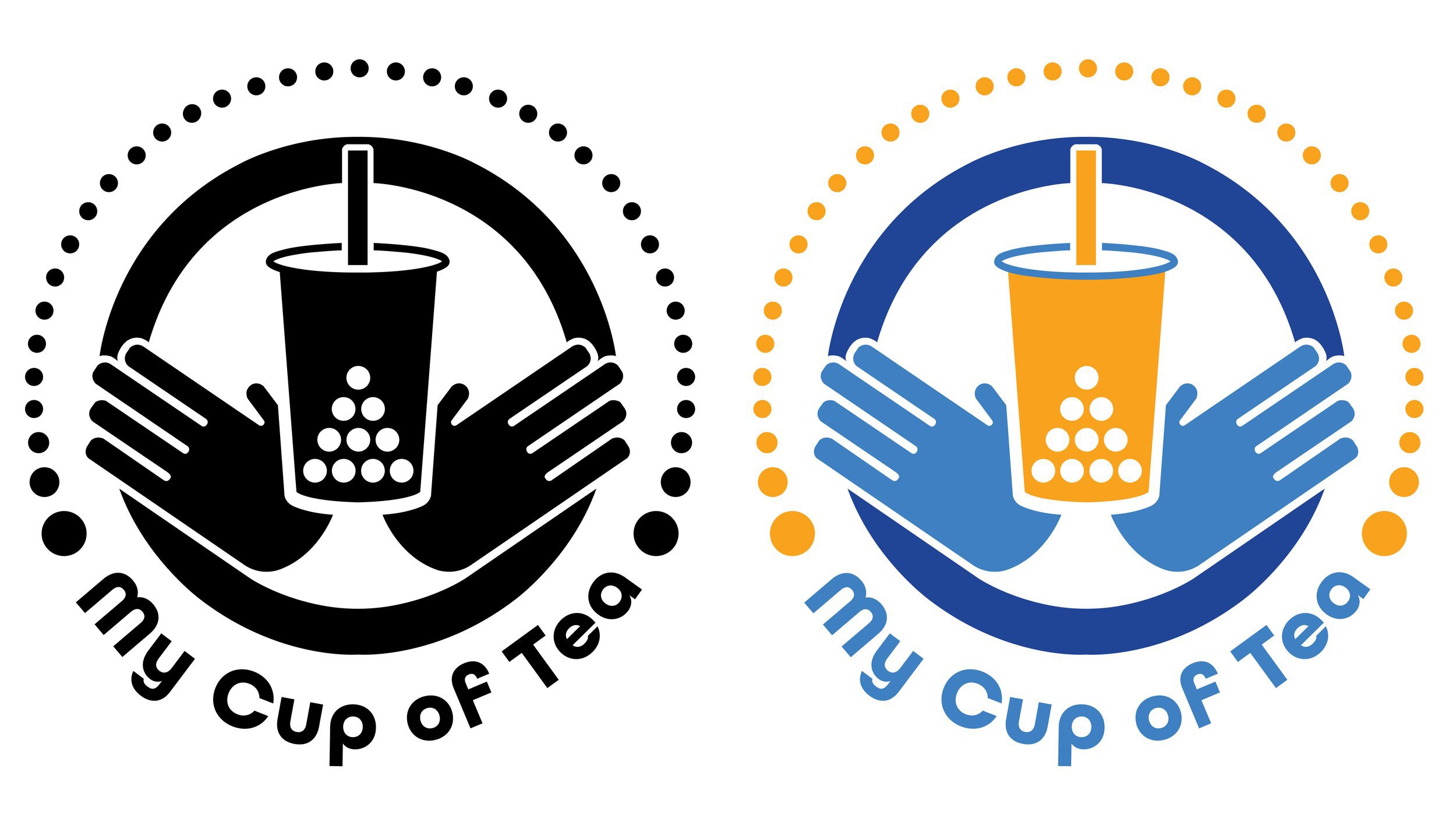
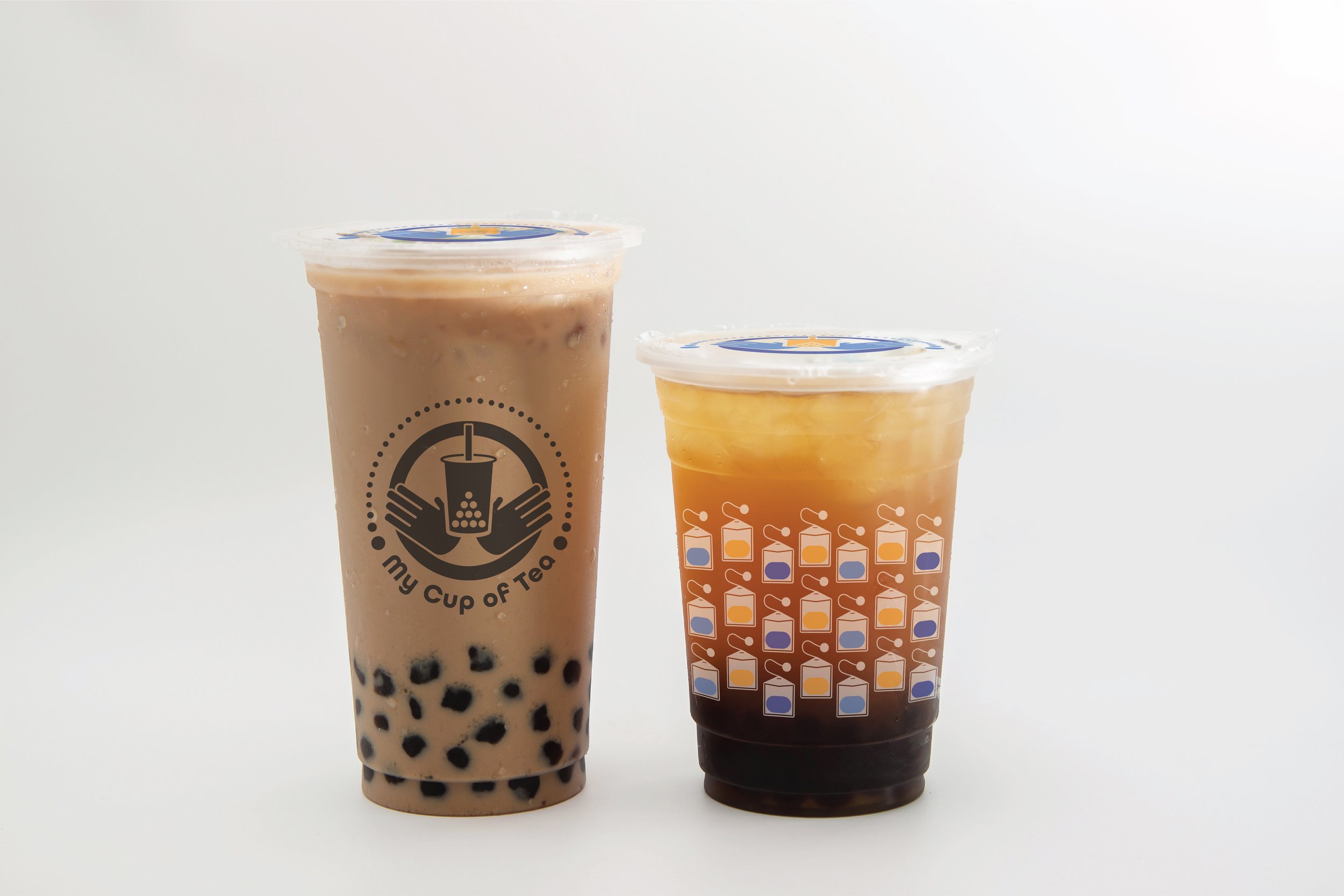
Then, I started some ideas on Adobe Illustrator in black-and-white. I played around with the letters of tea, putting Boba in the letter T. The idea behind the sketch I ended up choosing was based on the name. My Cup of Tea made me think it was the customers’ cup of tea. Therefore, I added hands to represent the users. I did multiple versions of the logo, progressing over time and then beginning with colors. I made different combinations of colors to see what worked best in the context of My Cup of Tea. The colors that I chose were based on the former interior of the establishment. After figuring out the logo for my cup of tea, I made mockups that included the logo and other visual elements like teabags and a lot of circular shapes. I would also make a business card for the place.
Research
The primary research that was done for this rebrand was to do market research. I looked at other establishments similar to My Cup of Tea. An analysis was done on their logos, websites, merchandise, and more. I also did the same research on My Cup of Tea themselves.
Findings
The logos of other boba shops are minimalistic, and very similar to one another.
My Cup of Tea had similar branding as other boba shops.
The demographics are teenagers, mostly Asians.
The imagery of some other boba shops include avatars and their drinks.
Process
At the beginning of this project, the first thing that I did was research. I did the research for competitors and analysis for My Cup of Tea themselves. I analyzed the branding of the website that they use in their presence within Yelp in the community. After looking at My Cup of Tea, I would start having an idea about what I wanted to do for this rebrand. The sketching phase began. I would create a lot of sketches relating to My Cup of Tea and elements like boba, drinks, and more.
